To be or not to be (decisive moment)? That is the question.

The Brief ; –

“give some careful thought to the ‘decisive moment’ debate and note down where you stand (at the moment, anyway) in your learning log.”

Cartier-Bresson’s “photographs are free of artificial effects, spontaneous; they make icons of scenes that the rest of the world would scarcely notice.”  Quoted from The Fine Art Society in association with Peter Fetterman Gallery 6 to 29 october 2015 who displayed the work of HCB. The following photograph is one most people will recognise as being a famous image by a famous photographer, and HCB admits this was a shot that owed more to luck than good judgement and being in the right place at the right time. In fact this image is cropped as the other ends of the frame are out of focus as HCB shot this through a   set of railings. Therefore is this skill, luck, or even a combination of the two.

Let’s look at the skill part first of all. HCB was a photographer who spent time surveying, looking hunting and waiting. More than likely he had chosen this spot due to the reflections the water offered and he would have been aware he could poke his lens throng the railings. The shot may have been interesting any way without the man in the foreground, but he was aware enough to foresee this happening. The image would be reasonably  well-balanced without the jumper, this just finishes the image off. HCB talks about millimetres counting for the image to be well framed and this can be seen by the positioning of the jumper’s left foot which is a fraction off the water adding a sense of excitement  to the image. He knew when to press the shutter release. He did not fire off hunters of images to see what he got, like the current trend with some street photographers  but he was more specific about what he wanted to capture.

Moving on to luck. He was rich enough to have a camera and be able to spend his time doing what he wanted and loved. The man may not have jumped or even been there. His lens could fit through the railings.

Having spent time thinking about the above it is a combination of luck and skill that makes this and some of his other images what they are. Therefore can someone be lucky all the time or are they riding their luck whilst relying on the skill they know they have.

untitled

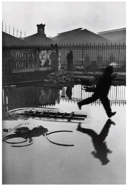
Photo taken from The Fine Art Society in association with Peter Fetterman Gallery 6 to 29 october 2015 who displayed the work of HCB.

What is a decisive moment? What is “decisive” and what is a “moment”.

Decisive = having or showing the ability to make decisions quickly and effectively.

Moment = a very brief period of time.

To have a “decisive moment” you must be in the right place at the right time. But is what I call a decisive moment the same as some else. The answer to that is no. I can illustrate this in the following image I shot for a previous assignment. My decisive moment was the light on the lady’s face in the top left third of the frame. My tutor’s moment was the lady clasping her hands behind her back.

20161019-oca-eyv-part-two-09
1/50, f2.8, ISO 200, 100mm, Pattern

To be a good photographer you need to be decisive, as you want to portray your thoughts and ideas in print or via digital media. You will always capture a moment as that is what a photo is, a moment of history that you have preserved in time, from your viewpoint. You also must have some of lady luck shining down on you. You may not even spot what the viewer classes as the decisive moment, but for me you should have this in mind when pressing the shutter release. This will give you a consistency (that all good photographers want). It will develop  a style of your own and your work will become recognisable as yours.

My feelings may change as I reflect on further work in the course.

Selects for 3.1 and 3.2

I have grouped these two exercises together to highlight the difference between fast and slow shutter speed. There are 4 selects from each group below. All of the images were shot as Jpegs and are totally unedited.

The process for both exercises was the same. Mount the camera on a tripod, partially fill a bowl with water, ensure my focus is correct by using a test shot at the point where the drip would be, using a dummy target of a floating piece of paper. Place focus in manual so as not to disturb it. Set the shutter speed and ISO and that was about it.

It made good sense to use the same subject for both exercises as the differences are more apparent this way.

I had to use different shutter speeds to get the results I wanted and a large number of images were shot as per my contact sheets. A large number of images was needed due to the unpredictability of the bounce that would be generated and the patterns that were thrown off. I have not moved the tripod to ensure framing is the same. I wanted to have some bowl curvature in the shots as this would give a nice balance to the bouncing water and also add some context to show the ordinary setting used. Natural daylight and my kitchen spots were also used to help light the bowl and water.

I love the motion created by the slow shutter speed and if you look closely the spray/droplets have created an astronomical look and in one image there is almost a huge “sun flare”.

This exercise lasted about 2 hours in total from planning to shooting to wrapping up. I am happy with these results. It also goes to show how interesting it must have been at the invention of photography when such results could be achieved for the first time. I wonder how long it took the pioneers to do this. I had the beauty of digital on my side which also made my life easier.


More research

The following 3 images all freeze the moment but Muybridge was amazing as it first proved photography could be used to prove what the eye could not see.

Part three. Traces of time pre work research.

Decisive moments?

I have taken the images from http://stevemccurry.com/galleries (accessed 26/10/2016). Steve McCurry’s images hold a special place in my heart and below are a few examples which are apt for the current part of this course.

I have been asked to produce contact sheets more frequently as part of my feedback. I have done some research to see how these are done by Steve McCurry and there are a couple of examples below. Here you can see the selects and the non selects and this is what I will aim for going forwards.

untitled5
http://stevemccurry.com/galleries
untitled6
http://stevemccurry.com/galleries


Assignment Two Feedback

Overall Comments

A thoughtful submission that fulfills the brief.

Feedback on assignment Demonstration of technical and Visual Skills, Quality of Outcome, Demonstration of Creativity

 Notes from, and in addition to, our Skype tutorial :

We discussed how you have acted like a flaneur in making this work. Its worth checking out the book Psychogeography, plenty of references in it to the history of this ‘way of seeing’.

Sad to hear that permission to photograph was denied at LUFC.

Interesting that it was no problem to photograph at Sheffield station – we discussed the idea of privilege.

You have used a variety of vantage points, and this has still managed to retain a coherence, possibly due to them being the same viewpoints we would expect to find on a similar commute.

Your edit is arranged in an order that would make sense as a story of the journey.

You were also asking yourself ‘what is a crowd’? Looking for some purpose, an order, a seriality. This is really interesting, starting from a definition, from a commonly understood place is useful when attempting a critique.

To create images of interest you attempted a ‘frame within a frame’.

We discussed your bridge image using punctum and studium. It adhered to one of Barthes’ ideas in that, what the photographer intended is not necessarily what arrests the viewer’s attention. The side-lit woman in the middle ground for you and the clasped hands of the woman in the foreground for me.

References – Phillip-Lorca diCorcia, Beat Strueli, Paul Graham

You understood that the assignment was about a concern with aperture, forcing you to observe, being intuitive, having your antennae out – I think you have been successful here

The final image in the series is pushing the envelope of the definition ‘crowd’. It was a conscious decision on your part to attempt social commentary. You are to be commended for trying to use camera and technique to get create a political meaning for the work.

In attempting a narrative, perhaps the weakest image in the series is the first. Looking at the series purely aesthetically I would aim to tie red into this first shot – and leave an absence of red in the last as a prompt to encourage viewers to look further.

Take confidence from having moved out of your comfort zone and challenged yourself in making images of people..

Learning Logs or Blogs/Critical essays Context

 With reference to the exercise shots of your dad – Bruce Gilden

Pu some of your thoughts on books you have read in your blog.

Suggested reading/viewing Context

 Keep up with the books! See one reference above.

 Pointers for the next assignment

For assignment 3 I suggest; keep it critical.

Assignment Two

Three’s A Crowd? 

Brie

Create a series of between six and ten photographs from one of the following options, or a subject of your own choosing:

  • Crowds
  • Views
  • Heads

Use the exercises from Part Two as a starting point to test out combinations of focal length, aperture and viewpoint for the set. Decide upon a single format, either vertical or horizontal. You should keep to the same combination throughout to lend coherence to the series.

Crowds make a great subject for photography, not least because they are so contemporary. A city rush hour is a good place to start but events also offer great opportunities to photograph the crowd rather than the event. The foreshortened perspective of the telephoto lens will compress a crowd, fitting more bodies into the frame, but it can also be used to pick out an individual person. A wide-angle lens can capture dynamic shots from within the action. I have chosen to concentrate on crowds. 

What is a crowd and how is this linked to photography?  

  • A crowd is a gathering of people, large or small, in a certain place at a certain time. A photograph is an image taken at a certain place at a certain time.
  • Crowds are not there forever, but they gather and disperse. Photos are there in their entirety, they do not disperse and do not gather. They are created in an instant (usually).
  • Crowds can be read. Photographs can be read. They are both a sort of language.
  • Crowds can be large or small. Photographs also come in different sizes.
  • Both can show emotion, be violent, appreciative, sad, ecstatic etc.
  • Both can be colourful.
  • Crowds have a purpose. All photographs have a purpose too, at the time of taking, as this is why the photographer takes the shot.
  • Crowds and photos tell a story.
  • Both form opinion of the participant.
  • Crowds are not conformed by shape; photography is made “in frame”.
  • Crowds can be planned and controlled, as can photos.
  • Both can be policed and subject to censorship.
  • Crowds are managed, photographs are composed.
  • Both involve people and are world-wide.
  • People in a crowd can stand out from the crowd and so can images stand out too.
  • It is my intention to bring this link together, showing some of the main characteristics of both. I have not just simply shot a large group of people.  I have tried to tell the story of the crowd by using the different techniques learned.

The shoot was not planned. I headed off to Sheffield in search of a crowd as my home town is somewhat of a ghost town. I did not have a theme, just the words “crowds” to play with.

I have used a number of different techniques I have learned so far. This is also the first set of images that contain people. None of the images are captioned, with the exception of the basic Exif data, as I want the spectator to think about each image and what it means. They are also ambiguous.

Demonstration of technical and visual skills

I have used a selection of apertures ranging from f2.8 to f11. My place for the crowd was Sheffield train station and I tried to encompass the surroundings into the image where possible, giving the crowd context. All of the images were hand-held shots and shots and decisions were made in an instant.

Image 1 starts with how crowds gather at the station, as the crowd begin buying their tickets.  The aperture used keeps the majority of the image sharp and the angle of the shot with the lines of the floor and ticket machines take you down the line.

Image 2 was designed to show the frustration people feel with waiting for trains. I have kept the background of the line and surrounding station in focus to place the crowd. I have also tried to concentrate on the faces of the passengers as they wait.

Image 3 uses diagonals to draw you through the image. The aperture keeps the main players in the image in clear focus as it does the train. Due to shooting in Aperture mode there is no direct control over shutter speed, so you have to compromise at times.

Image 4 shows the crowd in the background and also how people can stand out from the crowd. (literally). Due to the aperture used the main crowd in the background can be seen.

Image 5 would have the majority of players in focus if they were still. The train is pretty much in focus and so are the reflections. However, I wanted to create some idea of movement, yet keep the lady at the front of the image as the main player.

Image 6 has people beginning to exit the station. The light was just right to capture the lady in the top left third. With a large aperture I tried to make her stand out from the crowd and the relatively slow shutter speed has created some motion blur.

Image 7 is of the crowd dispersing. It shows also how some people do not belong to the “in crowd” and how people just ignore those less fortunate. I have tried to keep the majority of this image in focus but use the wall and the paving to lead the viewer to the man begging, with his cap in front of him. The behaviour of the 2 teenagers is completely contrasted to that of the beggar.

Quality of outcome

I am happy with how the story unfolds and I have tried to think outside of the box, by not simply photographing a crowd, but I have tried to apply some creativity to the brief. I could have used more images of crowds, but I did not feel this set needed further images.

Demonstration of creativity

I have shown what crowds are, how people stand out from the crowd and how some less fortunate do not belong to the “in crowd”. The images have been shot from different angles. Head height, on stair cases, from the floor and sat on a wall. I have stood back from the crowd and also been in the thick of things. I have continued with my theme of not being afraid to make a “political” point, by including the poor man begging in the last image.

Context

On reflection, I may have been better shooting a few more images, further showing “crowds” but I did not want to detract from my story. One aspect I would have liked to incorporate more into my story was the use of wider apertures (smaller f stops) having looked at and enjoyed Gianluca Cosci’s work, but I felt too worried about losing my background and placement. This use of small apertures may have helped create a bit more tension and mystery in some of the images. I could have been more varied in my use of lenses but I was shooting in the instant.


Research for Imaginative Spaces

I have spent some considerable time reading books and looking at sites online to get  a further insight into the Aperture and its’ effect. Please see my reference list.

I have shot in Aperture mode before, but never for such a protracted period and I have found this part hard, as I like to be in full control. Every photo taken (these days) needs an aperture and it is partially due to this how the story  of the image is told. Using the wrong aperture  for example, can leave the eyes in a portrait looking weird with only  one eye in focus when both may be better depicted as sharp. Using a small aperture will also give need for the camera to be secured in some way, due to the corresponding shutter speed that is needed.

Certain photographers such as Mona Kuhn use wide parterres as their theme , whereas Ansell Adams preferred to use small apertures. Different photographers have different opinions and some use a variation of apertures. It all depends what they want to portray, their style, their politics and their artistic license.

Photography is bound up in a collection of numbers, which in essence are an equation, it is how you express those numbers to get the answer you want. The more successful photographers get the equation right, whilst at the same telling telling a great story and creating a sense of  the spectator wanting to look and explore the image, rather than skimming over it.

untitled

Ansel Adams used small apertures to great effect and belonged to the Group f/64  “The Group will show no work at any time that does not conform to its standards of pure photography. Pure photography is defined as possessing no qualities of technique, composition or idea, derivative of any other art form.”  quote and photo taken from http://photographyhistory.blogspot.co.uk/2012/04/group-f64-manifesto-1932.html.

Fay Godwin’s work is also interesting as she is trying to educate through her work. In the image below which is typical of her work a small aperture has been chosen to ensure the whole image can be seen. Her work is moody, heartfelt and takes time to view.

untitled
Image taken from http://www.faygodwin.com/landmarks/im06/index.html

Gianluca Cosci’s work is still trying to educate and gain needs time too view each image but this is almost an opposite to Fay Godwin’s work as he uses the shallowest depth of filed available as in the image below.

untitled
image taken from http://www.gianlucacosci.com/page13.htm

Examples of what is out there, to assist with the effects of different lenses and the effect of depth of field.


Personal archive photo taken on 23rd April 2012.

harry004
1/160, f1.8, 50mm, ISO 400, Spot.

Shallow depth of field used in this image as I wanted to lose the background completely (it was dark) but I also wanted to create a feeling of general softness. The light was good coming in through the window. The arm did not really holding great interest other than leading to the had, so I was happy for this tone blurred. My focus point was not the baby’s hand but the father’s index finger as this would add a small amount of contrast to the image between the rougher knuckles of the adult compared to the delicate skin of the baby. Now having re-assessed the image, a smaller aperture (higher f number may be f5) would have added greater clarity whilst still retaining the feeling of softness. It would have required a lower shutter speed and or higher ISO to maintain the sharpness.  I do like this image though, as it is.

When completing my research I have compiled a separate reference list which needs to be read independently.


Reference List for Imaginative Spaces

Barnes, R (1993) Camer Lucida, 2nd edn., London, England : Vintage Classics.

Bauhaus (08/10/2016) Bauhaus Movement | Magazine & News, Available at: http://www.magazine.bauhaus-movement.com (Accessed: 11/10/2016).

Berger, J (2013) Understanding a photograph, 13th edn., St Ives, Cornwall, England: Clays Ltd.

Grepstad, J (1996) Pinhole photography history and guide from photo.net, Available at: http://photo.net/pinhole/pinhole (Accessed: 11/10/2016).

Kirkpatrick, K (2016) Early Works, Available at: http://www.kimkirkpatrick.com/GalleryMain.asp?GalleryID=97163&AKey=FGWAF5R9 (Accessed: 17/10/2016).

Kuhn, M (2016) Collections Acido-Derado, Available at: http://www.monakuhn.com/collections/view/acido-dorado/ (Accessed: 17/10/2016).

Lima, M G (2016) The introduction to the history of photography:Group f/64, Available at: http://photographyhistory.blogspot.co.uk/2012/04/group-f64-manifesto-1932.html (Accessed: 20/10/2016).

Nikon (2014) Nikon | Imaging Products | DSLR Camera Basics | Perspective , Available at: http://imaging.nikon.com/lineup/dslr/basics/19/03.htm (Accessed: 16/10/2016).

The Phillips Collection (2014) What is a cyanotype, Available at: http://blog.phillipscollection.org/2012/05/04/what-is-a-cyanotype/ (Accessed: 11/10/2016).

Unknown (May 2005) Fay Godwin homepage, Available at: http://www.faygodwin.com/bio.html (Accessed: 20/10/2016).

Weston, E (1948) Edward Weston The Photographer Documentary 1948. Unknown Director via YouTube. (Accessed 11/10/2016)

Wikipedia (12/09/2016) Anna Atkins – Wikipedia the free encyclopedia, Available at: https://en.wikipedia.org/wiki/Anna_Atkins (Accessed: 11/10/2016).

Exercise 2.4

20161020-oca-eyv-part-two-01
1/200, f8.00, ISO 200, 160mm, Pattern

Say hello to my dad. He is 79 years old and he was more than willing to act as my model.

It was interesting to try to get him keep his eyes open, as he has a tendency to keep them almost  closed, and he squints due to his glaucoma. I also wanted to get a natural feel to the shot, which I feel has been achieved. I asked my dad to stand with his shoulders at an angle and asked him at first to look at the floor and slowly look up whilst thinking of the holidays we shared when I was a young child. This did not work, so I asked him to change this by moving his torso slowly from left to right, whilst holding the same thought.

 The notes for the exercise asks the student to use a wide aperture (small f-stop) and I decided upon f8 as i wanted to ensure with eyes were sharply in focus with the rest of his head. Dad’s eyes are interesting as they are naturally cloudy due to his age and glaucoma. In addition he has deep-set eyes and does suffer with dark patches around his eyes due to the medication he uses.

I chose to shoot outside with purely natural light and I have shot this without a reflector. The sun was shining down as you look at the image from left to right and was slightly behind my dad as I wanted to ensure the sun was not in his eyes.

The brief asked for a natural balanced portrait and I believe that this has been achieved due to the lighting and also due to the composition. Dad’s right eye sits nicely on the top left third. All of the face is sharp, with the background being blurred as a result of the aperture used with a small amount of bokeh apparent in the confer hedge in the background. The background whilst being blurred does add a warm feeling to the overall image due to the green and yellow shapes which can be clearly seen. The roses just over dad’s shoulder also gives this portrait a setting, thatch be identified and is something my dad loves, hence I included them in the shot.

I am quite happy with this shot and it has been treated with approved by my mum and dad. John Berger talks about photography having a language and images being read. It is my opinion this is easily read in a number of ways (though).

The shutter speed of 200 was needed due to the focal length of the lens and this also had a baring on the f stop as this was shot in Aperture mode.